Neutral color interiors offer a sophisticated canvas for creative expression. This design approach, prioritizing calming palettes of whites, grays, beiges, and creams, provides a versatile foundation upon which to build a personalized and aesthetically pleasing space. Understanding the nuances of color psychology, texture, lighting, and strategic pops of color is key to unlocking the full potential of this timeless style.
This guide explores the art of creating serene and stylish homes using neutral color schemes. We’ll delve into creating balanced palettes, incorporating textures and patterns, harnessing the power of lighting, and adding impactful accents to personalize your space. Whether you’re drawn to minimalist chic, Scandinavian simplicity, or the warmth of farmhouse style, neutral tones offer a flexible framework for achieving your desired aesthetic.
Defining Neutral Color Palettes
Neutral color palettes form the foundation of many successful interior design schemes. Their versatility allows them to serve as a backdrop for bolder accent colors and textures, while simultaneously creating a sense of calm and sophistication. Understanding the nuances of different neutrals and their psychological impact is key to achieving the desired atmosphere in any space.
Common Neutral Color Palettes in Interior Design
Neutral palettes typically revolve around variations of white, beige, gray, and brown. However, the range within each of these colors is vast, offering a multitude of options for different styles and moods. Shades, which are darker versions of a color, add depth and drama, while tints, lighter versions, create a sense of airiness and openness. For example, a deep shade of gray might be used in a sophisticated living room, while a light tint of beige could brighten a small bedroom. The use of off-whites, greige (a blend of gray and beige), and taupe (a muted brownish-gray) further expands the possibilities.
Three Distinct Neutral Color Palettes for Different Rooms
The following table Artikels three distinct neutral color palettes, each tailored to a specific room type and intended atmosphere.
| Color Name | Hex Code | Description | Suggested Use |
|---|---|---|---|
| Warm White | #FAEBD7 | A creamy, slightly yellowish white that evokes warmth and comfort. | Bedroom walls, creating a calming and inviting space. |
| Soft Gray | #D3D3D3 | A light, versatile gray that complements a variety of colors and textures. | Bedroom accents, such as bedding or curtains, providing a neutral backdrop. |
| Taupe | #A0522D | A muted brownish-gray that adds depth and sophistication. | Bedroom furniture, offering a grounding element to the room’s design. |
| Greige | #BFBFBF | A sophisticated blend of gray and beige, offering a timeless elegance. | Living room walls, providing a calming yet stylish backdrop. |
| Light Beige | #F5F5DC | A soft, warm beige that enhances natural light and creates a welcoming ambiance. | Living room upholstery, offering a neutral base for pops of color. |
| Charcoal Gray | #36454F | A dark, sophisticated gray that adds depth and contrast. | Living room accents, such as throw pillows or artwork, introducing a sense of drama. |
| Off-White | #FFFFF0 | A slightly creamy white that adds warmth without being overly yellow. | Kitchen cabinets, providing a clean and bright foundation. |
| Warm Gray | #808080 | A versatile gray with warm undertones that works well with both cool and warm colors. | Kitchen countertops, creating a sense of calm and sophistication. |
| Light Brown | #DEB887 | A soft brown that adds warmth and a natural feel. | Kitchen backsplash, adding texture and visual interest. |
Psychological Effects of Neutral Colors
Different neutral colors evoke distinct psychological responses, influencing the overall mood and atmosphere of a space. Warm neutrals like beige and cream create a sense of comfort and coziness, making them ideal for bedrooms and living rooms. Cooler neutrals such as gray and off-white can feel more sophisticated and modern, suitable for kitchens or bathrooms. The intensity of the shade also plays a role; darker shades can feel more dramatic and intimate, while lighter shades promote feelings of openness and spaciousness. For instance, a deep gray might be perceived as sophisticated and calming in a home office, fostering concentration, while a pale beige in a nursery might be seen as nurturing and comforting for a baby.
Incorporating Texture and Pattern
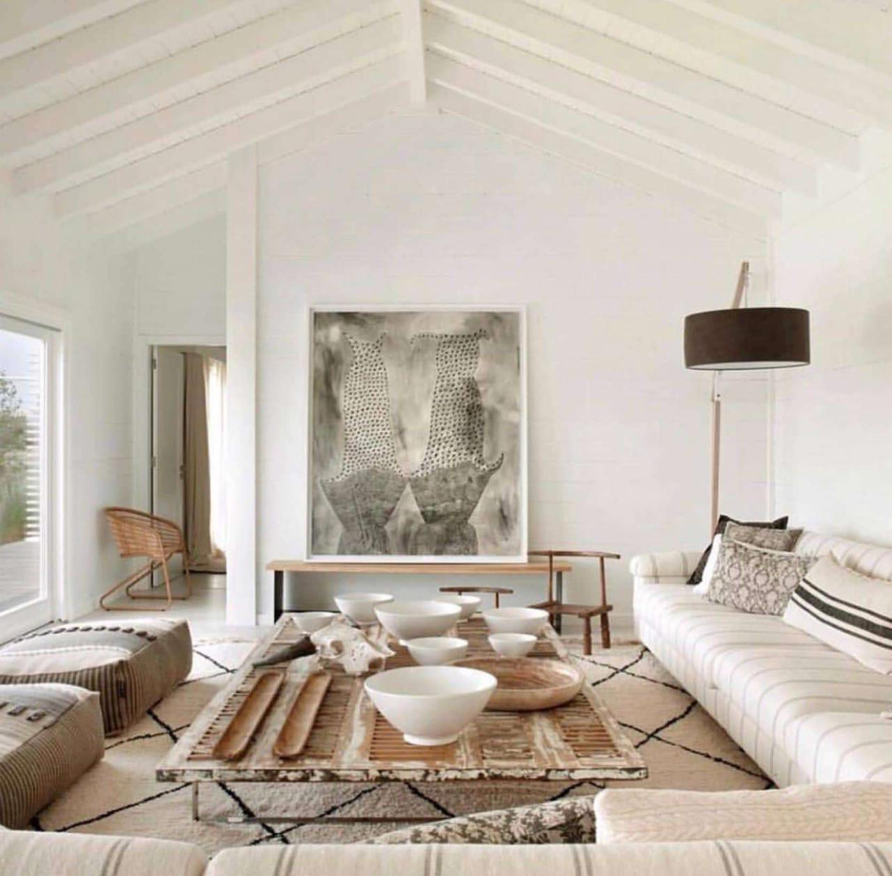
Neutral color palettes, while inherently calming and versatile, can sometimes feel a little flat without the addition of texture and pattern. These elements introduce visual interest and depth, preventing the space from feeling sterile or monotonous, while still maintaining the serene atmosphere that neutral tones provide. The key is to introduce these elements thoughtfully, ensuring they complement rather than clash with the overall color scheme.
The strategic use of texture and pattern adds layers of visual richness to a neutral interior. Different textures can play with light and shadow, creating a sense of movement and dynamism, even within a restrained color palette. Similarly, carefully selected patterns can introduce personality and style without disrupting the overall feeling of tranquility. This careful balance is essential to achieving a sophisticated and inviting space.
Texture Examples in Neutral Interiors
Adding texture is crucial for creating a visually engaging and tactile space within a neutral color scheme. A variety of materials can be used to introduce varying levels of texture, ranging from subtle to bold. The goal is to create a multi-sensory experience, appealing to both the eye and the touch.
- Woven fabrics: Think chunky knit throws on sofas, linen curtains with a slightly irregular weave, or a jute rug with a naturally coarse texture. These introduce a sense of warmth and handcrafted quality.
- Natural materials: Incorporating natural materials like wood, stone, or rattan adds an organic element. A wooden coffee table with a visible wood grain, stone countertops, or rattan pendant lights all contribute to a rich textural landscape.
- Textured wall coverings: Consider textured wallpaper, grasscloth, or even a simple plaster finish with subtle variations in the surface. These can add depth and visual interest to the walls without introducing strong colors.
- Velvet upholstery: Luxurious velvet fabrics in neutral shades like beige, gray, or charcoal add a touch of opulence and a soft, plush texture to seating areas.
Pattern Examples in Neutral Interiors
Patterns, when carefully chosen, can elevate a neutral space from simple to sophisticated. The key is to select patterns that complement the overall color palette and avoid overwhelming the space with too much visual stimulation.
- Geometric patterns: Subtle geometric patterns, such as stripes or simple checks, in muted tones can add visual interest without being overly distracting. These patterns work well on rugs, cushions, or even wallpaper.
- Floral patterns: Delicate floral patterns in soft, muted colors can introduce a touch of femininity and elegance. However, it’s important to choose patterns that are not too busy or overpowering.
- Abstract patterns: Abstract patterns can add a modern and artistic touch to a neutral space. Look for patterns with subtle color variations within the neutral palette.
- Ikat patterns: The slightly blurred and imperfect nature of ikat patterns adds a unique texture and visual interest, especially when used in textiles like cushions or throws.
Mood Board: Neutral Interior with Texture and Pattern
Imagine a living room with walls painted in a warm, creamy white. The floor is covered with a large jute rug in a natural beige, adding a coarse texture. A linen sofa in a light gray is complemented by several throw pillows: two in a subtle geometric pattern of charcoal gray and cream, and one in a muted floral pattern featuring dusty rose and beige. A wooden coffee table with a visible wood grain sits in the center of the room, providing a contrasting texture to the softness of the sofa and rug. A large woven basket sits beside the sofa, adding another layer of natural texture. The overall aesthetic is calm, sophisticated, and inviting, with the textures and patterns adding depth and visual interest without disrupting the serene atmosphere of the neutral color palette. The space feels both relaxed and stylish, showcasing the effective use of texture and pattern within a neutral color scheme.
The Role of Lighting in Neutral Spaces
Neutral color palettes, while inherently versatile, rely heavily on lighting to truly shine. The interplay between light and these understated hues dramatically impacts the overall mood and perceived warmth of a space. Different lighting types – natural, ambient, task, and accent – each contribute uniquely to shaping the atmosphere and highlighting the subtle nuances within a neutral scheme.
Lighting significantly alters the perception of neutral colors. Warm-toned lighting, for example, can imbue even the coolest greys with a sense of coziness, while cool-toned lighting can enhance the crispness of whites and the sophistication of deeper neutrals. The intensity and direction of the light also play a crucial role, affecting the shadows cast and the overall visual texture of the space.
Ambient Lighting in Neutral Living Rooms
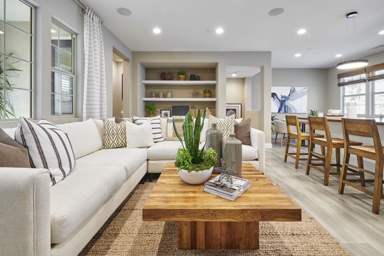
Ambient lighting provides the foundational illumination for a room. In a living room with neutral walls, a combination of sources is ideal. Recessed lighting, strategically placed throughout the ceiling, offers even illumination, preventing harsh shadows and ensuring a consistent base level of brightness. This is complemented by a statement light fixture, such as a large pendant light or a modern chandelier, positioned above a central seating area to draw the eye and add visual interest.
Task Lighting in Neutral Living Rooms
Task lighting focuses illumination on specific activities. Floor lamps, positioned near reading chairs, provide focused light for reading or relaxing. Table lamps, placed on side tables or coffee tables, offer additional localized light for tasks such as working on a laptop or playing board games. These task lights not only enhance functionality but also add to the layered lighting scheme, creating depth and visual interest.
Accent Lighting in Neutral Living Rooms
Accent lighting is used to highlight architectural details or artwork. Track lighting, positioned to highlight a gallery wall showcasing framed prints or family photos, adds a dramatic touch. Similarly, small spotlights focused on sculptural elements or textured wall features draw attention to these details and add a layer of visual complexity.
A Living Room Lighting Plan
The following table Artikels a sample lighting plan for a neutral-toned living room, aiming for a warm and inviting atmosphere:
| Lighting Type | Fixture Type | Placement | Purpose |
|---|---|---|---|
| Ambient | Recessed lighting | Ceiling | Even, overall illumination |
| Ambient | Large pendant light | Above seating area | Statement piece, focused illumination |
| Task | Floor lamps | Beside reading chairs | Reading light |
| Task | Table lamps | Side tables, coffee table | Ambient light, task lighting for smaller activities |
| Accent | Track lighting | Above gallery wall | Highlight artwork and architectural details |
Warm versus Cool Lighting in Neutral Spaces
Warm-toned lighting (around 2700K-3000K) casts a yellowish hue, creating a cozy and inviting atmosphere in neutral spaces. It softens the look of stark whites and greys, adding a sense of warmth and intimacy. In contrast, cool-toned lighting (around 5000K-6500K) casts a bluish or white hue, making neutral colors appear crisper and cleaner. This can enhance the modern or minimalist aesthetic, but may feel less welcoming in a living space. The choice depends entirely on the desired mood and style. A living room aiming for a relaxed and inviting feel would benefit from warm lighting, while a home office might benefit from the more focused and energized feel of cool lighting.
Adding Pops of Color with Accessories
Neutral palettes, while elegant and calming, can sometimes feel a little…flat. Adding pops of color through carefully chosen accessories is a simple yet powerful way to inject personality and visual interest into a neutral space without sacrificing the overall serenity. This approach allows for flexibility and easy updates as your style evolves.
The strategic use of color accents can significantly impact the mood and feel of a room. By selecting complementary color families and thoughtfully placing accessories, one can create a dynamic and engaging interior without overwhelming the neutral base.
Color Families that Complement Neutral Palettes
Three color families that consistently harmonize with neutral backgrounds are jewel tones, earthy tones, and pastel shades. Jewel tones, such as emerald green, sapphire blue, and ruby red, add a touch of luxurious drama. Earthy tones, including terracotta, olive green, and burnt orange, bring warmth and a sense of natural connection. Pastels, such as blush pink, lavender, and mint green, offer a softer, more romantic touch. The key is to choose one or two families, rather than mixing them all together, to maintain a cohesive look.
Strategic Incorporation of Color Accents
Let’s explore how these color families can be used effectively through accessories:
Imagine a living room with a beige sofa and cream walls. Introducing a large, emerald green velvet throw pillow adds a sophisticated pop of color, contrasting beautifully against the neutral tones. A smaller, sapphire blue textured pillow adds another layer of visual interest without overpowering the space. The contrast between the velvet and texture introduces another element of visual depth.
In a bedroom with gray walls and a white bed, a terracotta-colored rug adds warmth and anchors the space. The rug’s texture, perhaps a chunky knit or a woven design, further enhances the visual appeal. A collection of smaller terracotta-colored ceramic vases, varying in size and shape, placed on a bedside table adds a subtle yet effective touch of color and visual interest.
Finally, consider a dining room with light gray walls and a natural wood table. A set of blush pink linen napkins, paired with a similarly colored table runner, introduces a delicate and romantic feel. A large piece of abstract artwork incorporating shades of lavender and mint green on the adjacent wall further enhances the pastel theme, adding a sophisticated visual focal point.
Visual Representation of Colorful Accessories in a Neutral Bedroom
Imagine a bedroom with soft, off-white walls and a light gray carpet. The bed features crisp white linens. On the bed, three throw pillows are arranged: one large, square pillow in a deep teal (a jewel tone), one smaller rectangular pillow in a creamy off-white with a subtle embroidered pattern in a muted olive green (earthy tone), and one round, plush pillow in a pale blush pink (pastel). A woven jute rug with subtle hints of terracotta runs alongside the bed, adding texture and a warm earthy tone. On the bedside table sits a small, clear glass vase filled with dried lavender sprigs, complementing the pastel pink pillow and adding a touch of natural texture. A framed print of a landscape in muted greens and browns hangs above the bed, tying in the earthy tones from the rug and pillow. The total effect is a harmonious blend of neutral tones and carefully selected color accents that create a calm yet visually interesting space.
Neutral Color Schemes in Different Interior Styles
Neutral color palettes offer incredible versatility, adapting seamlessly to a wide range of interior design styles. Their inherent adaptability allows for the creation of unique and personalized spaces, regardless of the chosen aesthetic. By carefully selecting shades and incorporating complementary textures and materials, designers can leverage the calming and sophisticated nature of neutrals to craft truly distinctive interiors.
The application of neutral colors varies significantly depending on the overall design style. Understanding these nuances allows for a more informed and effective use of these versatile hues. The following sections will explore how neutral colors are employed in three distinct interior design styles: minimalist, Scandinavian, and farmhouse.
Minimalist Interior Design with Neutral Colors, Neutral color interiors
Minimalist design prioritizes simplicity, functionality, and clean lines. Neutral colors are fundamental to achieving this aesthetic, creating a sense of calm and spaciousness. The palette typically features a limited number of shades, often focusing on variations of white, gray, and beige. These are used to create a cohesive and uncluttered backdrop that allows architectural details and carefully selected furnishings to take center stage.
- Color Palette: Off-white walls, light gray flooring, and various shades of beige in textiles and furniture.
- Materials: Polished concrete, natural wood (often light-toned), and sleek metal accents.
- Textures: Smooth surfaces are favored, with occasional use of subtle textures like linen or brushed cotton in upholstery.
Key characteristics of neutral color use in minimalist design include the emphasis on a monochromatic or very limited color scheme, the preference for clean, unadorned surfaces, and the strategic use of texture to add subtle visual interest without overwhelming the minimalist aesthetic.
Scandinavian Interior Design with Neutral Colors
Scandinavian design embraces a similar minimalist ethos but incorporates elements of warmth and natural light. Neutral colors are integral to this style, often featuring a lighter, brighter palette than minimalist designs. The goal is to create a feeling of airy spaciousness while maintaining a cozy and inviting atmosphere.
- Color Palette: Bright whites, soft grays, and muted beige or cream tones are dominant, often accented with pale blues or greens.
- Materials: Light-colored wood (such as birch or pine), natural textiles like wool and linen, and occasional use of stone or ceramic.
- Textures: A mix of textures is common, including the softness of wool throws and the natural grain of wood, creating a tactile and inviting space.
In Scandinavian design, the use of neutral colors differs from minimalist styles by incorporating a brighter and warmer palette, emphasizing natural materials and textures, and allowing for a greater degree of visual interest through the incorporation of subtle patterns and textures.
Farmhouse Interior Design with Neutral Colors
Farmhouse style evokes a sense of rustic charm and comfortable living. While neutrals play a crucial role, they are often warmer and more textured than in minimalist or Scandinavian designs. The goal is to create a welcoming and lived-in feel, reflecting the warmth and simplicity of rural life.
- Color Palette: Warm whites, creamy beiges, and muted browns are common, often complemented by darker accents in wood or metal.
- Materials: Reclaimed wood, stone, and natural fibers such as cotton and burlap are frequently used.
- Textures: Rougher textures are embraced, including the natural grain of wood, the woven texture of textiles, and the rustic feel of stone or brick.
The key difference in the use of neutral colors in farmhouse style is the emphasis on warmer tones, the incorporation of rustic and textured materials, and the creation of a cozy and inviting atmosphere through the strategic use of natural elements and textures. The overall feel is less clean and more deliberately lived-in compared to minimalist and Scandinavian aesthetics.
Ultimate Conclusion: Neutral Color Interiors
Ultimately, mastering neutral color interiors involves a harmonious blend of thoughtful planning and artistic intuition. By understanding the interplay of color, texture, light, and strategically placed accents, you can craft a space that is not only visually appealing but also deeply reflective of your personal style and promotes a sense of calm and well-being. The versatility of neutral palettes allows for endless customization, ensuring your home remains a sanctuary tailored to your evolving tastes and needs.
Neutral color interiors create a serene and calming atmosphere, perfect for a minimalist aesthetic. Effectively maximizing space within this style often requires clever solutions, and that’s where resources like Minimalist storage hacks become invaluable. By implementing these strategies, you can maintain the clean lines and uncluttered feel that neutral palettes represent, ensuring your space remains both stylish and functional.
Neutral color interiors offer a versatile backdrop for any style, easily adapting to seasonal changes. To achieve that warm, inviting autumnal feel, consider incorporating elements from the Cozy fall home decor trend; think rich textures and earthy tones. These additions complement neutral palettes beautifully, enhancing the overall cozy ambiance without sacrificing the clean aesthetic of a neutral color scheme.